Perks
Identity / Web Layout / UX/UI
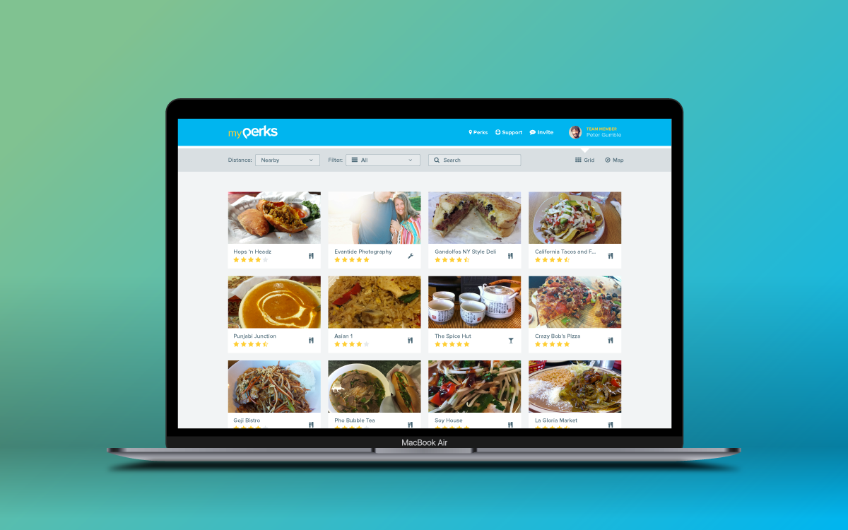
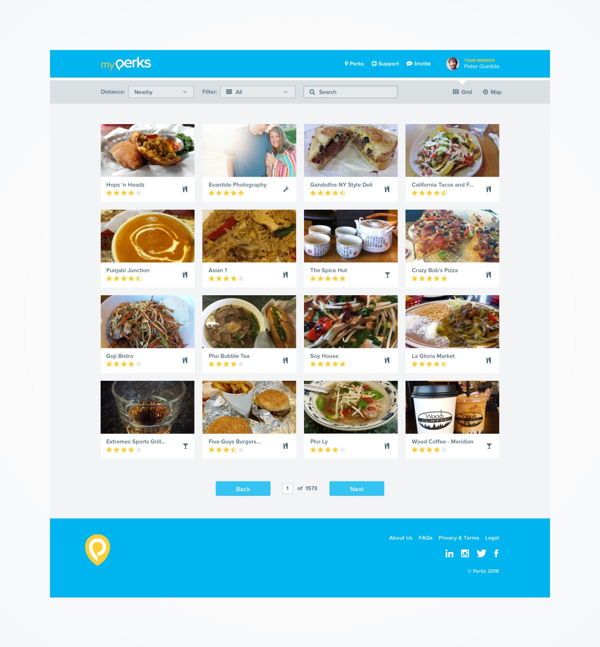
Perks was an application created to give local businesses the ability to build culture by giving teams access to exclusive offers and savings for participating businesses. The application’s UI was designed with 3 distinct audiences in mind.
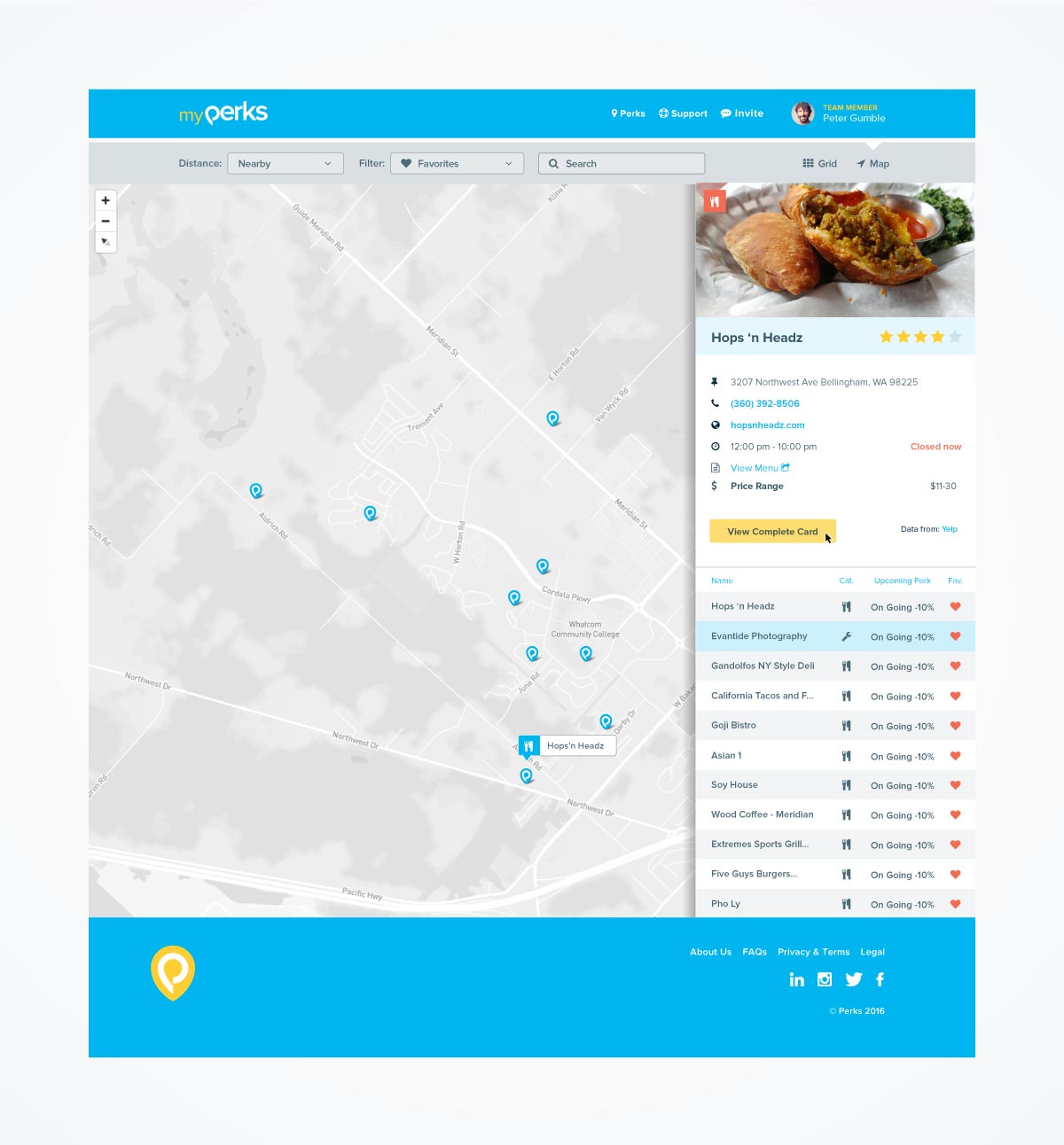
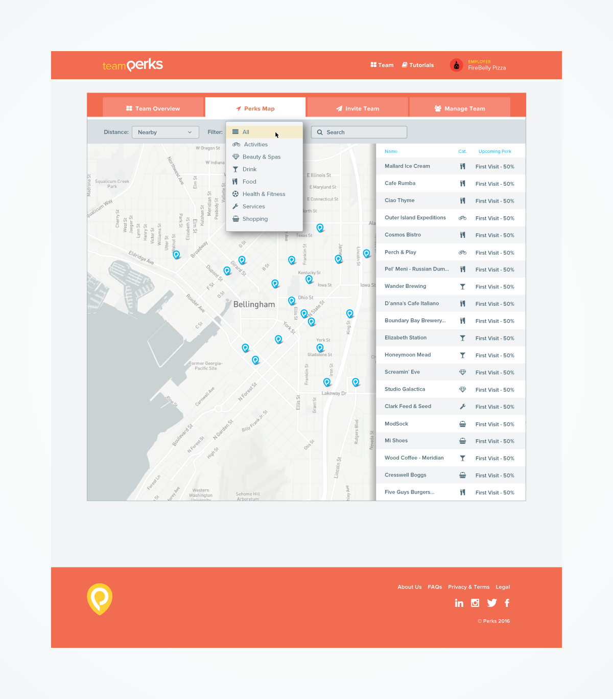
First, the application needed to be able to: 1. help users quickly identify where participating merchants were located based on their geolocation, 2. identify what type of savings they were able to access by engaging with these local businesses, and 3. write reviews based on the service and savings they received.
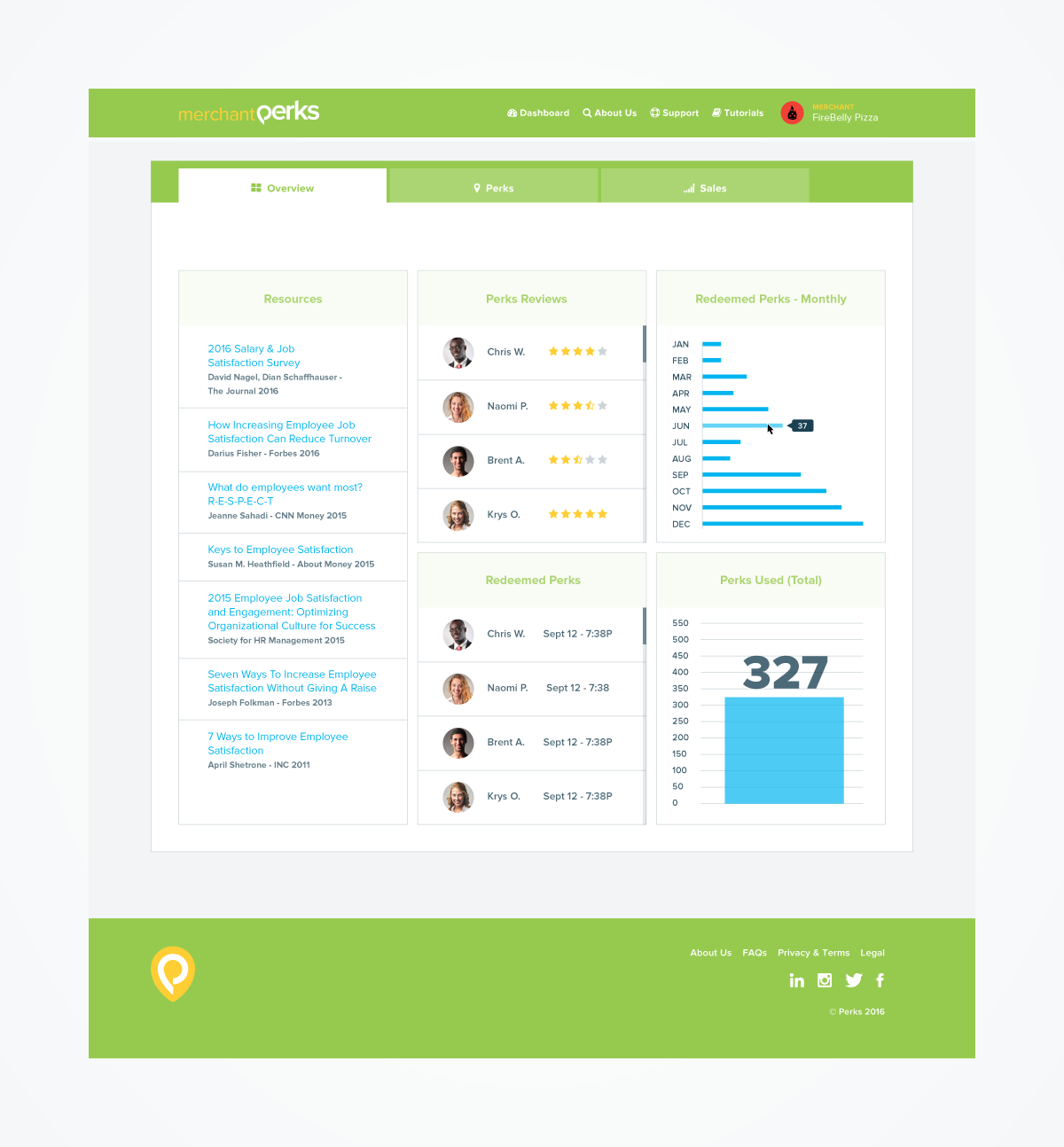
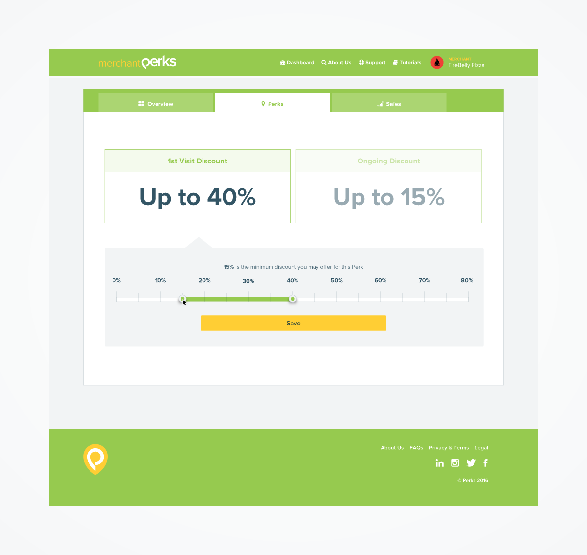
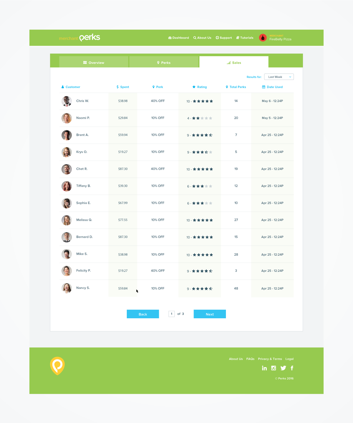
Second, participating merchants needed to be able to access who was visiting their businesses, what reviews were given, set their tiered saving schema, and track sales. Theoretically they could learn from their audience and use the information to build personas around their desired customers.
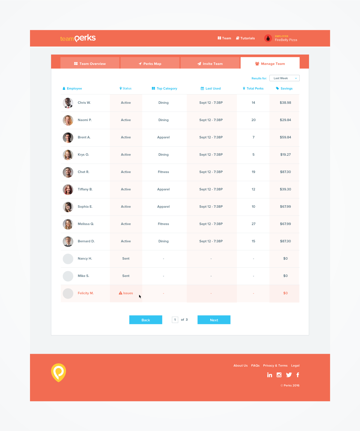
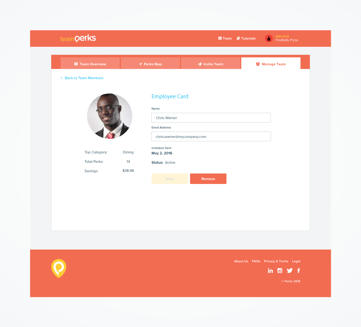
Finally, managers needed to be able to identify who was on their teams and extend the invitations to new employees. For most users, the UX was pretty straight forward. However, some users could be merchants, team leaders, or participants. It was critical that these users be able to immediately identify where they were in the application.
Working with the project UX designers, I used color as the key visual component to help these power users navigate their way through the various parts of the application.